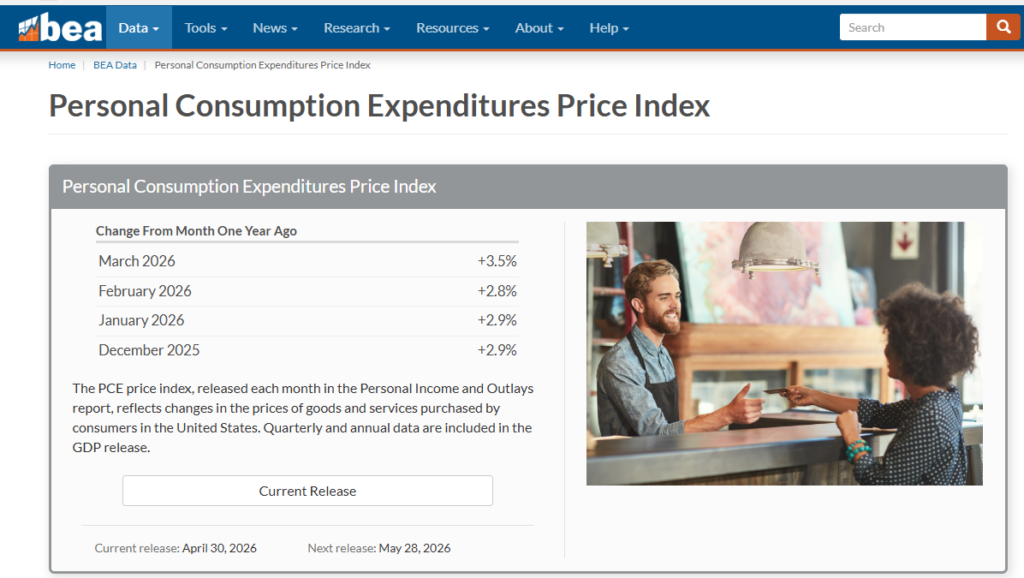
Everything you need to know before Wednesday’s release — what PCE actually measures, how to read it like a professional, what it does to your portfolio, and what this specific print means for the Fed’s next move.
There is a number that moves bond markets, reprices equity multiples, shifts the dollar, and recalibrates the Federal Reserve’s entire policy calculus. It drops this Wednesday, May 28, at 8:30 AM Eastern. Most people will glance at the headline, read a two-sentence summary on their phone, and move on.
That is a mistake.
The PCE price index-Personal Consumption Expenditures is not just another inflation data point. It is the inflation data point, at least as far as the Fed is concerned. And right now, with core PCE running at 3.2% year-over-year, 120 basis points above the Fed’s 2% target, with four consecutive months of inflationary strength, and a new Fed chair navigating a geopolitically complicated environment, this release carries more policy weight than almost any print in the last two years.
This piece will take you from “PCE is the Fed’s preferred inflation gauge” a sentence that tells you essentially nothing to a full understanding of what PCE actually is, why it behaves differently from CPI, how to read the composition rather than just the number, how the Fed mechanically responds, what it does to bonds and equities and the dollar in sequence, and what Wednesday’s specific print means for the soft landing thesis.
Start from the beginning. Every step.
WHAT PCE ACTUALLY IS — AND WHY IT’S NOT CPI
Most people have heard of CPI- the Consumer Price Index. It’s the number that shows up in news alerts when the Bureau of Labor Statistics releases monthly inflation data. If you’ve been paying attention to inflation over the past few years, CPI is probably the number you’ve been watching.
The Fed doesn’t use CPI as its primary inflation target.
It uses PCE. And the difference between the two is not trivial. Understanding why the Fed made that choice tells you something important about what the Fed is actually trying to measure and what it’s worried about.
Two Inflation Gauges, Two Different Questions
Here is the core distinction: CPI asks “how much does a fixed basket of goods and services cost?” PCE asks “how much are Americans actually spending, and what are they paying for it?”
That difference sounds subtle. It isn’t.
CPI is constructed by the Bureau of Labor Statistics. Every couple of years, they survey households to determine what a “typical American” buys like housing, food, transportation, healthcare, entertainment, and so on. They lock in those weights. Then every month, they go track what those items cost. If steak prices rise 20%, that’s fully captured, regardless of whether anyone is still buying steak at that price.
PCE is constructed by the Bureau of Economic Analysis. Rather than surveying households and locking in a basket, the BEA uses actual spending data on what Americans are really buying, sourced from business revenues, healthcare billing systems, and national accounts. If steak gets too expensive and everyone switches to chicken, PCE captures that behavioral shift. CPI does not.
This is called substitution bias, and it’s one of the most important concepts in inflation measurement.
“CPI measures the price of what you used to buy. PCE measures the price of what you’re actually buying. In a world where consumers constantly adapt to price signals, those are very different things.”
Substitution bias means CPI tends to overstate inflation slightly, because it assumes people keep buying the same things even as prices rise. In reality, people adapt. They trade down. They change their behavior. PCE captures that adaptation. Over time, CPI typically runs 20-30 basis points higher than PCE for this reason alone. That gap matters enormously for a central bank trying to calibrate policy to the fraction of a percent.
Why the Fed Fired CPI and Hired PCE
The Federal Reserve formally adopted PCE as its preferred inflation gauge in 2000. The reasoning was exactly what you’d expect: the Fed is trying to manage price stability for the actual U.S. economy, not a hypothetical fixed basket. PCE better reflects real-world spending behavior, gets revised more comprehensively to incorporate new information, and historically shows lower volatility due to its broader coverage.
There’s another dimension that matters enormously: healthcare. In CPI, healthcare spending is measured primarily as what consumers pay out of pocket like copays, premiums they personally write checks for. In PCE, healthcare is measured as total healthcare spending, including what employers and government programs pay on your behalf. Since third-party payments account for the vast majority of U.S. healthcare expenditure, PCE captures a much larger share of real healthcare costs. Healthcare is roughly 17% of PCE and only about 8% of CPI. That weighting difference alone can drive meaningful divergence between the two indices during periods of healthcare cost inflation.
Expenditure weights– the percentage of the index assigned to each spending category are critical to understanding why the two indices can diverge sharply.
Think of it this way- if housing costs rise sharply, the effect on your measured inflation depends entirely on how much weight housing gets in the index. In CPI, shelter (housing costs) receives roughly 35% of the total weight. In PCE, shelter gets around 15-17%. So, a surge in rent prices hits the CPI headline number about twice as hard as it hits PCE, mechanically.
That’s not a bug. It reflects the different methodological choices. CPI is measuring what a consumer household experiences. PCE is measuring what the entire consumer sector spends, which includes many more categories distributed across a broader base.
A Concrete Example: The Same Economy, Two Different Numbers
To make this real: during 2022 and 2023, when inflation was at its most severe post-pandemic, CPI and PCE diverged meaningfully. At the peak in mid-2022, CPI headline was running above 9%. PCE headline peaked closer to 7%. The difference? Primarily shelter weight and the substitution effect. People were clearly switching away from expensive items- fewer restaurant meals, cheaper cuts of meat, more generic brands. PCE captured that behavioral response. CPI didn’t.
For the Fed’s purposes, using PCE meant they were calibrating to a slightly more moderate but arguably more accurate picture of consumer price dynamics. The policy path would have looked even more aggressive had they been targeting CPI directly.
Here’s the practical upshot: when you see a CPI number and a PCE number for the same month, expect PCE to be lower. When they converge, it tells you something about the nature of the inflation which is probably broad-based, with less room for substitution. When they diverge sharply, it typically tells you that a specific category (often shelter) is driving CPI more than it’s driving PCE, and the Fed may be less concerned than the headline suggests.
“The gap between CPI and PCE is not noise. It’s information. When that gap widens, the Fed is probably less alarmed than CNBC. When it narrows, the Fed is probably more concerned than the headline suggests.”
HOW TO READ A PCE PRINT LIKE A PROFESSIONAL
The number itself “core PCE came in at X%” — is almost the least important thing in the release. Analyze what the number reveals about the underlying dynamics of inflation: where the pressure is coming from, how persistent it’s likely to be, and what it implies for where prices go next.
Here’s how to actually read it.
Headline vs. Core: The First Filter
Every PCE release contains two top-line numbers: headline PCE and core PCE.
Headline PCE includes everything like food, energy, goods, services. All of it. It’s the broadest read on consumer price dynamics. It’s also the most volatile, because food and energy prices can swing dramatically based on weather events, geopolitical shocks, or supply disruptions that have nothing to do with underlying economic demand.
Core PCE strips out food and energy. The logic is straightforward: if a hurricane disrupts oil production and gasoline prices spike for six weeks, that doesn’t tell you anything meaningful about whether the economy is running too hot. The Fed can’t lower inflation by cutting interest rates faster than a hurricane resolves. Monetary policy works on a 12-18 month lag. It’s designed to address persistent, demand-driven inflation, not temporary supply shocks. Core PCE is meant to strip out the noise and isolate the signal.
The Fed’s 2% inflation target is explicitly stated in core PCE terms.
So when you see a headline number flash across your screen, your first question should always be: “What did core do?” If headline spiked because of an oil price surge but core held steady, the Fed probably isn’t moving. If core came in hot even while headline was benign, that’s actually the more alarming signal.
Month-Over-Month vs. Year-Over-Year: The Momentum Question
Every PCE release gives you both a month-over-month (MoM) change and a year-over-year (YoY) change. These answer different questions.
Year-over-year tells you where we are relative to twelve months ago. It’s the “level” read- are we at 2%, 3%, 4%? This is the number compared to the Fed’s target.
Month-over-month tells you what’s happening right now. This is the momentum read- is inflation accelerating, decelerating, or stable? A YoY reading can stay elevated for months simply because of what happened a year ago, even if the current monthly pace has completely normalized. Conversely, YoY can look deceptively calm while monthly prints are actually re-accelerating.
The professional shorthand: annualize the monthly number and compare it to the YoY. If core PCE rises 0.3% in a single month, that annualizes to roughly 3.6%. If the YoY is showing 3.2%, you’re accelerating. If it rises 0.15% in a month, that annualizes to about 1.8% which is well below the YoY reading, meaning the trend is decelerating even though the headline number still looks elevated.
Right now, with core PCE at 3.2% YoY, the monthly trend is the crucial question. March’s 0.3% MoM print annualizes to 3.6%. That’s the acceleration the Fed is watching.
Services vs. Goods: The Structural Divide
The most important compositional split in any PCE release is goods vs. services.
Here is the fundamental difference: goods prices respond relatively quickly to supply chain dynamics, import costs, and inventory levels. Services prices are driven primarily by labor costs and tend to be much stickier- once they go up, they don’t come down easily, because you can’t easily lay off all your employees when inflation falls.
During the 2021-2022 inflation surge, goods led the way. Supply chain disruptions, pandemic-related production shutdowns, and massive consumer spending on physical products (because we couldn’t spend on services) drove goods prices sharply higher. By 2023, goods inflation was largely resolved. Supply chains normalized. Inventories rebuilt. Goods disinflation ith prices rising at a slower rate or even falling became a powerful force pulling headline numbers lower.
Services inflation is a different beast. Services inflation driven by rising costs in insurance, healthcare, and specialized business services has shown little sensitivity to high interest rates that successfully cooled the housing and goods sectors over the past two years. This is not an accident. You cannot import cheaper haircuts. You cannot build a factory that produces medical care at lower unit costs the way you can produce more semiconductors. Services inflation is fundamentally labor-cost inflation, and it responds to the labor market not to supply chains.
The current problem in a sentence: goods disinflation is largely exhausted, and services inflation remains stubborn. That combination is what has pushed core PCE back up toward 3.2% after briefly flirting with 2.6-2.7% in mid-2025.
The Supercore: The Number the Fed Really Watches
Beyond headline, beyond core, there is a subset of the data that has become the focus of sophisticated Fed-watchers: supercore. It has an official academic name- “core services excluding housing” but supercore is the term that stuck.
Here’s why it exists as a separate concept: housing costs (technically called “shelter” or “owners’ equivalent rent”) create a known, structural lag in inflation data. When actual rents in the market fall, it takes 12-18 months for that to fully show up in the inflation indices, because the indices capture the average of all existing leases — new leases, renewals, long-term contracts — not just current market rates. During 2023 and 2024, market rents were actively falling in many cities, but the shelter component of PCE kept rising because the statistical methodology was averaging in older, higher leases.
So the Fed faces a dilemma: shelter is a large component of PCE, but it’s also the component with the most distorted real-time signal. Strip it out, and what remains?
Supercore- services inflation excluding housing is what remains. This captures healthcare, financial services, insurance, transportation, food services, and a range of other service categories where prices reflect current labor market conditions almost directly. No lag. No methodological averaging effect.
The March growth rate in “Core Services Ex Housing” (supercore) PCE ran at a 3.44% year-over-year pace, an 86 basis point overshoot versus the roughly 2.59% run rate that coincided with 2% headline and core PCE inflation.
That’s the number. Supercore is running nearly a full percentage point above where it needs to be for the Fed to credibly claim it’s on track to 2%. And unlike shelter-driven inflation, there’s no mathematical “normalization” coming. Supercore stays hot as long as service-sector labor costs stay hot.
“Supercore is inflation with the excuses stripped out. No supply chains to blame. No shelter lag to wait out. Just wages passing through into prices. That’s the hardest kind to fix.”
The Simple Framework: What to Look for When the Number Drops
When Wednesday’s print hits at 8:30 AM, here is exactly what to look at and in what order:
First: core MoM. Is it 0.2% or lower (decelerating) or 0.3% or higher (re-accelerating)?
Second: annualize it. Multiply by 12. Is that annualized rate above or below the current 3.2% YoY? You’re checking momentum.
Third: services vs. goods split. Did goods stay disinflationary? Is services rolling over or still running hot?
Fourth: supercore. Services ex-housing. Is it above or below 3.44%? Any movement here is the cleanest signal of where the underlying trend is heading.
Fifth: personal income and spending. The PCE release also contains personal income and personal spending data. If spending is still running hot, demand-side inflation pressure hasn’t broken. If spending is falling while inflation stays elevated that’s a stagflation signal, and it’s a very different market event.
The headline number will be on every financial news site within seconds. The four data points above will tell you what the headline number actually means. Those take longer to surface, which is exactly why they matter more.
THE FED’S REACTION FUNCTION — HOW PCE DATA MOVES POLICY
To understand how a PCE print affects markets, you first have to understand how it affects the Fed. Because markets don’t react to the number directly, they react to what the number implies about what the Fed will do next. Get the Fed reaction wrong and you’ll misread the market move every time.
What “Data Dependent” Actually Means
You’ve heard Fed officials say they are “data dependent” approximately ten thousand times. This phrase sounds meaningful. It mostly isn’t at least not in the way most people interpret it.
“Data dependent” does not mean “we will cut rates if inflation falls and hike if it rises.” It means: we have a model of where we think the economy is going, and we will update that model when new data arrives, adjusting our policy path accordingly. The Fed is not reacting mechanically to each data point. It is updating a probabilistic forecast.
Practically, what this means for PCE specifically: the Fed is not watching any single monthly print. They are watching the trend across several prints, the composition of that trend (goods vs. services, supercore behavior), and whether the trend is consistent with their internal forecast path. A single hot month doesn’t trigger a hike. A single cool month doesn’t greenlight a cut. But string together three or four months of surprising data in the same direction, and the policy calculus shifts materially.
The Fed is in a pickle. Inflation on almost every relevant summary gauge is picking up steam. Four consecutive months of inflation readings running strong and given what’s anticipated from airfares and housing in April, we could see a fifth straight month of inflationary strength. It is fully understandable why FOMC members are getting uncomfortable with the current easing bias and shifting in a hawkish direction.
That’s the current situation. This is not a one-off hot print. It’s a trend.
The Asymmetry Between Cuts and Hikes
Here is something the market consistently underprices: the Fed’s reaction function is asymmetric. It is much harder for the Fed to justify cutting rates when inflation is above target than it is to justify holding rates when inflation is falling toward target.
Think about it from the Fed’s incentive structure. If the Fed cuts prematurely and inflation re-accelerates, they face a catastrophic credibility problem, they will have been seen to have declared victory too early, again, potentially triggering a 1970s-style stop-go dynamic where inflation keeps reigniting every time the Fed eases. That scenario damages the Fed’s institutional credibility for a generation.
If the Fed holds too long and the economy slows more than necessary, they cut rates and stimulate recovery. It’s painful. But it’s recoverable. The institutional and historical downside of the first scenario is far worse than the second.
This asymmetry has a direct translation for markets: the bar for the Fed to cut is higher than the bar for the Fed to hold. When core PCE is at 3.2% and the target is 2%, the Fed needs to see genuine, sustained disinflation before they move. A single month of softer-than-expected data is not that. Two months in a row might start a conversation. Three months with a clear compositional story, services rolling over, supercore decelerating would be the trigger.
The Rate Path and What Markets Are Pricing
The Fed funds rate is the interest rate at which banks lend reserves to each other overnight. It’s the Fed’s primary policy tool. By adjusting this rate, the Fed influences the cost of borrowing throughout the entire economy- mortgages, corporate bonds, auto loans, credit cards. Higher rates slow borrowing, cool spending, reduce demand, and eventually reduce inflation. Lower rates do the reverse.
The Federal Reserve concluded its third meeting of the year by maintaining the federal funds rate at 3.50%–3.75%. That’s where rates sit today. Markets, through instruments called Fed funds futures essentially bets on where the overnight rate will be at future dates and are pricing in the probability of rate changes at upcoming meetings.
A hot PCE print reduces the probability of cuts that are priced in. The futures price falls. Bond yields rise to reflect a “higher for longer” rate environment. A cool print does the reverse-cut probabilities increase, yields fall.
The mechanism is straightforward but the magnitude of the move depends on how far the print deviates from expectations. A stronger-than-anticipated PCE reading, particularly one that moves above the prior reading, would suggest persistent inflationary pressure, shifting rate cut expectations further into the future.
Here’s a simple before/after to make this concrete:
Before a hot print (core PCE comes in at 0.35% MoM vs. 0.25% expected):
- Markets pricing two cuts in 2026
- 10-year Treasury yield at 4.3%
- Fed funds futures imply first cut in September
After a hot print:
- Markets re-price to one cut, or none, in 2026
- 10-year Treasury yield pushes toward 4.5-4.6%
- First cut repriced to December at earliest, or 2027
- Dollar strengthens against major currencies
That repricing cascade from one data point is why professionals treat PCE as a tier-one event. It’s not academic. It directly reshuffles asset prices across every major class simultaneously.
Terminal Rate and the “Last Mile” Problem
Terminal rate is the Fed funds rate at which the Fed expects to stop tightening (or the rate to which they expect to cut before stopping). It’s the destination, not the journey.
The “last mile” problem a phrase you’ve probably heard refers to the fact that getting inflation from 4% to 3% is relatively easy. Getting from 3% to 2% is hard. Here’s why.
The easy gains in disinflation came from supply chain normalization, goods price declines, and the mechanical unwind of pandemic-era spending distortions. Those effects are largely played out. What remains is the structural services inflation that responds only to genuine labor market slack- people losing jobs, wages decelerating, service-sector margins getting compressed enough that businesses can’t pass through cost increases anymore.
The problem: the labor market appears to be “hoarding” workers. Despite a slight uptick in the unemployment rate to 4.4%, wage growth has remained stuck at 3.5%, providing a permanent “inflation floor” that PCE is more sensitive to than CPI.
Wage growth of 3.5% with productivity growth of roughly 1.5% means unit labor costs are rising at approximately 2%. For services companies, labor is 60-80% of their cost structure. So services prices need to rise roughly 2% just to maintain margins. That’s already at the Fed’s target. If wages are running faster which they are in many sectors, services inflation stays above 2% structurally, unless something breaks the wage-price dynamic.
That “something” is usually unemployment rising enough to give workers less bargaining power. The Fed knows this. It’s not an accident that disinflation stalled exactly where it did.
“The last mile of inflation isn’t an economics problem. It’s a labor market problem. And the Fed’s only tool for fixing the labor market is making the economy cold enough that employers stop competing for workers. That is an uncomfortable truth that doesn’t appear in press conferences.”
HOW PCE MOVES MARKETS — THE FULL TRANSMISSION CHAIN
When PCE prints, markets don’t all move at once in some random direction. There is a sequence. Bonds move first. Then equities reprice based on what bonds did. Then the dollar responds to the rate differential shift. Then commodities particularly gold adjust to the new real-yield environment. Understanding this sequence is how you avoid being the person who misreads the first move and gets run over by the second.
Bonds First: The Duration Trade
Duration is a measure of how sensitive a bond’s price is to changes in interest rates. A bond that matures in 30 years has very high duration- its price will fall sharply if rates rise, because you’re locked into an interest payment stream for three decades at a below-market rate. A bond that matures in 3 months has near-zero duration rates can move dramatically and the bond barely reacts.
When PCE prints hot, bond yields rise. When yields rise, bond prices fall. That’s a mathematical identity- yield and price are inversely related for any fixed-income instrument. The question is which part of the yield curve moves how much.
A hot PCE print primarily hits the front end and intermediate maturities – 2-year, 5-year Treasuries because these are most directly tied to expectations of where the Fed funds rate will be over the next 2-5 years. If PCE confirms that cuts are being pushed further out, front-end yields spike as futures re-price.
Before PCE Print-
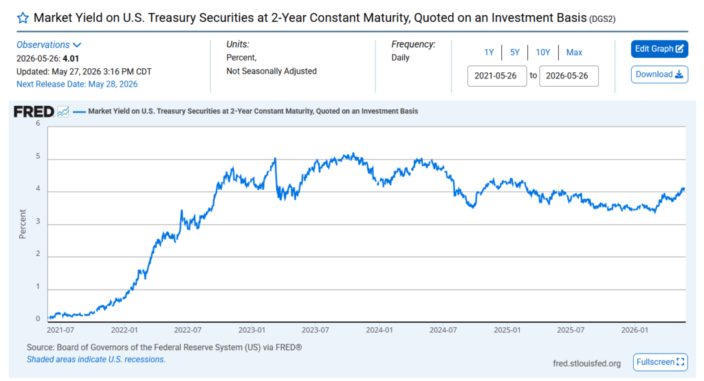
The 10-year yield– the most watched rate in global finance moves somewhat differently. It incorporates not just rate expectations but also term premium– the extra yield investors demand for holding a longer-duration instrument and absorbing the uncertainty of an entire decade. A hot PCE print adds to term premium concerns because it extends the period of uncertainty about the inflation path.
Before PCE Print–
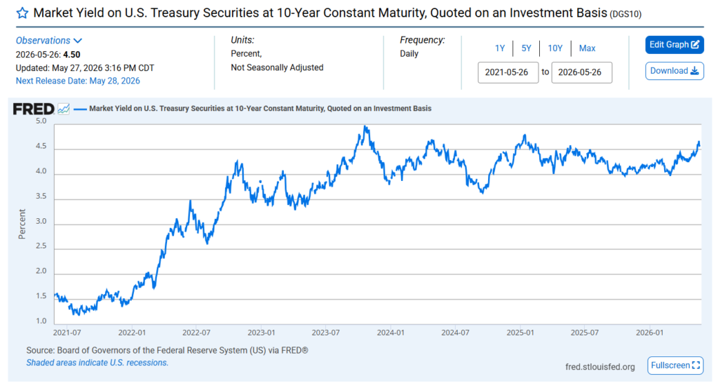
The 2-year Treasury is the Fed’s shadow. Watch it before, during, and after the print. If it moves 10+ basis points on the PCE number, that’s a significant policy repricing. If it barely twitches, the market already had it priced.
Equities Next: The Multiple Compression Mechanism
Here is the mechanism that destroys equity valuations in a rising-rate environment. Most people know rates going up is bad for stocks. Most people do not know exactly why.
Equity multiples specifically the price-to-earnings (P/E) ratio are driven fundamentally by the discount rate applied to future earnings. If you buy a stock, you’re buying a claim on future cash flows. The value of those future cash flows today depends on the rate at which you discount them back to the present. Higher discount rate → future earnings worth less today → lower fair-value multiple.
The discount rate for equities incorporates the risk-free rate (essentially, what you’d earn on Treasury bonds) plus an equity risk premium (the extra return you demand for taking on equity risk vs. guaranteed government paper).
When PCE prints hot, the risk-free rate rises (bond yields go up). Even if the equity risk premium stays constant, the total discount rate increases, compressing the fair-value multiple. A stock worth 22x earnings at a 4.3% 10-year yield might only justify 19x earnings at a 4.6% 10-year yield, even if the company’s actual earnings are unchanged.
Concrete math: A company earning $5 per share. At 22x earnings, stock is worth $110. At 19x earnings, stock is worth $95. That’s a 14% price decline with zero change in the underlying business fundamentals. That is the multiple compression mechanism. That is why growth stocks — which typically trade at high multiples because investors are paying for earnings many years into the future get hit hardest in a rising-rate environment. You’re not just compressing today’s multiple; you’re applying a higher discount rate to a longer stream of future cash flows.
A hot PCE number that reprices the rate path by 25 basis points can cause multiple compression of 1-3 turns in P/E ratio across the market, representing a 5-15% valuation hit independent of any change in earnings. Already explained in the tariff article part 2
The sectors that feel it most acutely are technology, consumer discretionary, and anything with high debt loads (since higher rates increase their interest expense directly). Financials can actually benefit from higher-for-longer rates through wider net interest margins. Energy is already partially priced through commodity dynamics. Utilities- traditionally bond proxies get hit hard.
Dollar Transmission: The Global Ripple
When the Fed is expected to stay higher for longer relative to other central banks, the dollar strengthens. This is the interest rate differential mechanism: capital flows toward the highest risk-adjusted return, and if U.S. rates are rising while European or Japanese rates are not, global investors sell euros and yen to buy dollars and park them in higher-yielding U.S. assets.
A stronger dollar has a cascade of second-order effects that most retail analysis ignores entirely:
U.S. multinationals take a hit. If you’re an S&P 500 company earning revenue in euros, pounds, and yen, and you report earnings in dollars, a stronger dollar reduces those earnings when translated back. Roughly 40% of S&P 500 revenues come from outside the U.S. A meaningful dollar rally directly compresses earnings mechanically, arithmetically, before a single consumer changes their behavior.
Emerging markets face dollar-denominated debt stress. Most sovereign and corporate emerging market debt is issued in dollars. When the dollar strengthens, the local currency value of that debt burden increases. Countries and companies that borrowed in dollars face higher effective debt service costs in their local currency. This can trigger capital outflows from EM assets as investors anticipate stress which then feeds back into tighter financial conditions globally.
Commodity prices fall in dollar terms. Most global commodities- oil, gold, copper, agricultural products are priced in dollars. A stronger dollar makes them more expensive for buyers using other currencies, which typically reduces global demand and pushes dollar prices lower. This is actually disinflationary for the U.S. in one sense (imports get cheaper) but creates pain for commodity-producing economies.
Gold is the clearest real-yield trade. Gold doesn’t pay interest. Its opportunity cost is the real yield on Treasuries the nominal yield minus expected inflation (technically captured by TIPS, Treasury Inflation-Protected Securities). When real yields rise (either because nominal yields rise faster than inflation expectations, or because inflation expectations fall), the opportunity cost of holding gold increases and gold prices typically fall.
“The bond market moves in seconds. The equity market reprices in minutes to hours. The dollar adjusts over hours to days. Commodities follow. Each leg of the sequence creates opportunities — and traps — for investors watching only one asset class.”
WHAT THIS WEEK’S PRINT ACTUALLY MEANS
This is the situational context that makes this specific PCE release- the April data releasing Wednesday, May 28 particularly consequential. We are not in a benign, gradually decelerating inflation environment where every print is mildly interesting. We are at an inflection point.
Where We Actually Are in the Disinflation Path
The story of 2024 and early 2025 was one of successful disinflation. Core PCE fell steadily from its 2022 peak of around 5.5% toward 2.6-2.7% by mid-2025. The soft landing narrative had genuine empirical support. The economy was slowing gradually. The labor market was loosening slowly. Inflation was falling toward target without a recession. Markets celebrated.
Then something changed.
Core PCE is running at a 3.20% year-over-year pace as of March, 120 basis points above the Fed’s 2% inflation target. Discretionary non-automobile goods and adjacent services are adding 80 basis points to the overshoot. Healthcare services are adding 12 basis points. Equity market effects are adding 10 basis points. Food inputs are likely adding 8 basis points to the overshoot. Airfares and moving services are adding 7 basis points.
This is not one category running hot. It’s a broad-based re-acceleration with multiple contributors. And it didn’t happen because of a single exogenous shock- it happened against a backdrop of an ongoing Middle East energy shock, tariff implementation beginning in April, and a labor market that never got loose enough to break the wage-price dynamic in services.
The question Wednesday’s print must answer: is March’s 3.2% core PCE reading a peak, or is it the latest step in a continuing re-acceleration?
If April prints at 3.0% or below particularly if supercore starts rolling over the narrative shifts. The disinflation trend resumes. Rate cut probability increases. Risk assets rally.
If April prints at 3.2% again, or higher especially if the monthly print is 0.3% or above the narrative hardens. The Fed is stuck. The soft landing is replaced by “higher for longer with growing growth risk.” That combination is the worst of both worlds.
The Soft Landing Thesis Under Stress
The soft landing– the scenario where inflation returns to 2% without a recession, where unemployment rises only modestly, and where the Fed can cut rates back to neutral without triggering a growth spiral is the market’s base case. It’s been the base case since 2023. And it keeps getting stress-tested.
Here’s the honest state of play. Q4 2025 came in at 0.5% annualized real GDP, a print that was revised down significantly through its three estimates. That is dangerously close to stall speed. An economy growing at 0.5% has very little buffer against a shock. And simultaneously, core PCE is re-accelerating.
That combination- slow growth plus rising inflation is the textbook definition of stagflation risk. Not stagflation itself, necessarily. But the probability distribution is skewing in an uncomfortable direction. The soft landing requires both growth holding up and inflation falling. Right now, growth is struggling and inflation is rising. Something has to give.
A hot Wednesday print- core PCE at 3.2% or above for a second straight month would force a meaningful repricing of soft-landing probability. Not an abandonment, but a repricing. That’s enough to move markets significantly.
Two Scenarios and What They Mean for Your Portfolio
Scenario A: April PCE comes in cool. Core at 0.15-0.20% MoM (annualizes to ~2%).
This would be a genuine surprise given the trajectory. The immediate reaction: front-end yields fall, cut probabilities for September increase, equities rally on multiple expansion (lower discount rate), dollar weakens modestly, gold rises on falling real yield expectations. The narrative shifts back toward “disinflation resumed, soft landing intact.” High-duration growth stocks benefit most. Rate-sensitive sectors (utilities, REITs) catch a bid.
Scenario B: April PCE re-accelerates. Core at 0.30%+ MoM (annualizes to ~3.6%+).
This is the more dangerous scenario given the current context. Front-end yields spike. The 2-year Treasury tests recent highs. Rate cut expectations evaporate for 2026 entirely. Equities sell off particularly tech and growth names, which are most duration sensitive. The dollar strengthens, putting pressure on EM assets and S&P 500 international revenues. Gold falls as real yields rise. The Fed is forced into an even more uncomfortable “hold” communication, risking credibility damage if growth continues to decelerate simultaneously.
I think markets are somewhat complacent here. The consensus is pricing a modestly soft print roughly 0.20-0.25% MoM on core. But given that CPI’s April print surprised to the upside, with headline inflation rising to 3.8% year-over-year its strongest since May 2023 and supercore running at 0.454% month-over-month after 0.179% prior, the inputs into April’s PCE are not supportive of a softening. PPI and CPI are the raw material from which PCE is constructed. Hot CPI plus hot PPI typically means hot PCE.
WHAT TO WATCH AFTER THE NUMBER DROPS
The print itself is 30 seconds of volatility. What happens in the 30 days after is what actually matters for portfolio positioning.
The Follow-Through Signals
Watch the 2-year Treasury over the following three trading days. The immediate reaction to PCE is often noisy- algorithms fire, positions adjust, headline readers trade the number rather than the composition. The 2-year settling 10+ basis points above its pre-print level by end of the following week is a genuine signal that the market is pricing a structurally different rate path, not just reacting to noise.
Watch Fed speaker commentary. The FOMC is in a blackout period before each meeting but speaks freely in the weeks surrounding data releases. If voting members start using language like “patience” and “elevated uncertainty about the inflation path,” they are signaling that cuts are further away than the market hopes. If they emphasize “labor market resilience” without addressing the inflation overshoot, they are telegraphing that growth concerns are entering the conversation and that stagflation risk is being privately acknowledged.
Watch supercore over the next two months. A single hot supercore print is concerning. Two consecutive months above 3.5% annualized would change the conversation from “can the Fed cut this year” to “does the Fed need to hike again.” That scenario is not the base case. But three months ago, 3.2% core PCE wasn’t the base case either.
Watch personal spending data. The PCE release includes not just prices but the actual level of consumer spending. If spending is falling while prices are rising, the Fed’s dilemma deepens — cutting would re-accelerate inflation, but not cutting means watching the consumer retrench further. That is the stagflation trap. It’s not where we are yet. But watch for it.
The New Fed Chair Dynamic
One element unique to this specific moment: May 15 was Jay Powell’s final day as Fed Chair. The Fed is now under new leadership. Markets will be watching the first significant inflation print under the new chair very closely not for what the policy response is (the FOMC sets policy collectively, not unilaterally), but for the communication around it. Does the new chair signal dovish comfort with elevated inflation? Does he push back hawkishly? The tone will set expectations for the entire 2026 policy regime.
A new Fed chair navigating a hot PCE print in their first weeks in office faces maximum scrutiny. Every word in the next communication will be parsed for what it signals about the Fed’s tolerance for above-target inflation. That adds a communication risk premium to Wednesday’s release that hasn’t existed in recent prints.
“Markets don’t just trade the data. They trade the Fed’s response to the data. And right now, nobody is entirely sure how the new chair will respond. That uncertainty alone is worth a few basis points of risk premium.”
The 30-Day Asset Class Playbook
If PCE surprises cool: Bonds rally (yields fall, prices rise). The front end leads. Growth equities outperform value. The dollar softens. Gold catches a bid. Emerging market assets get a relief rally as the dollar pressure lifts. The soft landing narrative gets a fresh lease on life.
If PCE surprises hot: Bonds sell off hard. The 10-year tests 4.5-4.6%. Growth stocks underperform sharply – expect 2-4x the index move in high-multiple tech names. Value and quality factor stocks outperform on a relative basis. The dollar strengthens, punishing multinationals disproportionately. Gold falls. Commodity exporters face a cross-current: dollar strength pushes commodity prices down, but if the hot print reflects genuine demand, some commodities (particularly energy-adjacent) may be more resilient. Morgan stanley has hinted at a hotter print
If PCE prints in line: Modest relief rally, then a return to the underlying trend. In-line prints after a period of upside surprises tend to be interpreted as “at least it didn’t get worse.” That’s a low bar. The underlying problem- core PCE at 3.2%, the Fed on hold, growth at stall speed doesn’t go away because one month comes in at consensus.
The honest answer: in this specific environment, an in-line or cool print probably produces a bigger market reaction than a hot one. The market is priced for caution. A genuine surprise to the downside on supercore would trigger aggressive repricing of cuts. A hot print confirms what many already suspect and produces a more muted, grinding adjustment. Asymmetry to the upside on risk assets if the number is cool. Grim grinding on the downside if it’s hot.